Sofia Pro: Embracing Harmony and Modernity in Your Design Journey
In the ever-evolving world of fonts, where bold statements and quirky personalities vie for attention, Sofia Pro stands out with a quiet confidence. This geometric sans-serif typeface, designed by Olivier Gourvat for Mostardesign, offers a harmonious blend of modernity and warmth, making it a versatile choice for designers seeking a font that is both elegant and functional.
From Parisian Birth to Global Appeal
Born in 2008 and revamped in 2012, Sofia Pro reflects the spirit of its Parisian origins. Its clean lines and subtle curves evoke a sense of sophistication and charm, while its rounded terminals and open counters add a touch of friendliness and approachability. This unique combination makes it suitable for projects targeting a wide audience, from corporate identities to editorial design.
Key Features, Lasting Impact
Several key elements contribute to Sofia Pro's enduring popularity:
- Extensive Family: With 16 weights ranging from Extra Light to Black, and both upright and italic styles, Sofia Pro offers a vast range of options to adapt to diverse design needs.
- Exceptional Readability: The generous letter spacing and open forms ensure clarity, even at smaller sizes, making it a great choice for both print and digital applications.
- Multilingual Support: Its extensive character set caters to global audiences, supporting over 500 glyphs and embracing various languages.
- OpenType Features: Optional stylistic sets and ligatures offer additional customization possibilities for designers seeking a more personalized touch.
Where Sofia Pro Shines
This versatile font finds its home in a variety of design applications:
- Branding and Marketing: Its clean lines and professional appearance lend themselves well to logos, brochures, and website design.
- Editorial Design: The excellent readability makes it ideal for body text in magazines, books, and reports.
- User Interfaces: The clear letterforms and multiple weights enhance user experience in digital applications.
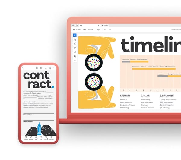
- Mobile Design: Sofia Pro's high x-height ensures optimal readability even on smaller screens, making it perfect for mobile apps and websites.
Beyond the Surface
Sofia Pro goes beyond aesthetics, prioritizing functionality and user experience:
- Expert Kerning and Spacing: The meticulous spacing between letters ensures optimal readability, even in complex layouts.
- Accessibility: Sofia Pro's clear forms and high contrast make it a good choice for designs aiming for accessibility.
Is Sofia Pro Right for You?
Sofia Pro's versatility makes it suitable for a wide range of projects. However, its minimalist approach might not resonate with designs seeking a more playful or expressive look.
Conclusion
Sofia Pro stands out as a modern sans-serif typeface that blends elegance, warmth, and functionality. Its diverse family, clear letterforms, and global accessibility make it a versatile choice for designers seeking a font that elevates their projects with sophistication and timeless appeal. Whether you're crafting a brand identity, designing a website, or creating a mobile app, Sofia Pro offers a reliable and adaptable option that will stand the test of time.


