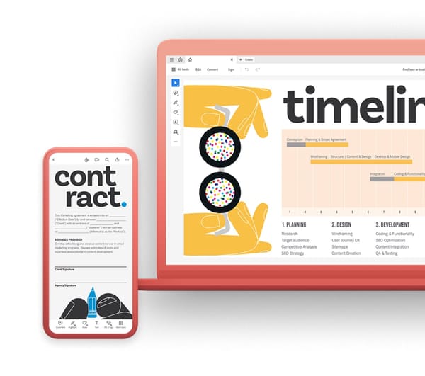
Futura PT: A Refined Legacy for Modern Design
Futura, the iconic geometric typeface designed by Paul Renner in 1927, has captivated designers for decades with its clean lines, timeless appeal, and diverse applications. Futura PT builds upon this legacy, offering a meticulously refined version that caters to the needs of contemporary design while preserving the essence of the original.
A Collaboration for Modernity
Futura PT was created through a collaborative effort between ParaType and the original typeface foundry Bauer Type Foundry. Recognizing the growing demand for digital fonts with enhanced functionality, the collaborators meticulously analyzed the original Futura design and implemented several key improvements.
Key Characteristics of Futura PT
- Enhanced legibility: Particular attention was paid to optimizing legibility, especially at smaller sizes and on high-resolution screens. This makes Futura PT a valuable choice for various digital applications, from web design to user interfaces.
- Expanded character set: Futura PT incorporates a wider range of glyphs, supporting additional languages and symbols compared to the original font. This increased versatility makes it suitable for designers working on global projects.
- Preserved core identity: Despite the refinements, Futura PT retains the core characteristics that made the original typeface so successful. The clean lines, geometric forms, and subtle humanist touch ensure that it seamlessly integrates into various design styles.
- Advanced OpenType features: Futura PT incorporates advanced OpenType features like small caps, stylistic sets, and contextual alternates, empowering designers with even greater control over their typography.
Applications of Futura PT
- Branding and logos: The clean lines and diverse weight range of Futura PT make it ideal for creating logos and brand identities that convey a sense of professionalism, sophistication, and modernity.
- Editorial design: The excellent legibility across various weights makes Futura PT suitable for headlines, subheadings, and body text in magazines, brochures, and other printed materials.
- Web design: Futura PT's clean lines translate well to digital platforms, ensuring optimal readability across various screen sizes and devices.
- App design: The clarity and versatility of Futura PT make it well-suited for user interfaces in mobile applications, ensuring clear communication and a user-friendly experience.
A Timeless Font for the Modern Designer
Futura PT represents the successful evolution of a beloved typeface. By honoring the legacy of the original while adapting to contemporary design needs, Futura PT offers a versatile and timeless solution for designers seeking a font that combines clarity, functionality, and a touch of geometric elegance. Whether used for branding, editorial design, or web applications, Futura PT empowers designers to create impactful and visually engaging experiences.


