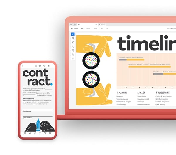
DIN Next: A Modern Evolution of an Industrial Strength Sans-Serif
DIN Next, born from the legacy of the iconic DIN typeface, stands as a testament to the power of refinement and adaptation. Originally designed for industrial signage in the early 20th century, DIN Next retains the core functionality and clarity of its predecessor while offering a modernized aesthetic and expanded versatility for contemporary design needs.
A Legacy of Clarity and Functionality
The original DIN typeface, developed by the Deutsches Institut für Normung (German Institute for Standardization), was renowned for its clear, legible letterforms and emphasis on functionality. Its straightforward design ensured effective communication in various industrial environments, making it a widely adopted standard.
Evolution for the Modern Age
DIN Next, created by Monotype in collaboration with Akira Kobayashi and Sandra Winter, builds upon this legacy while addressing the demands of contemporary design. The typeface retains the core characteristics of DIN, such as its clean lines, open counters, and robust letterforms, but incorporates subtle refinements for improved legibility and a more contemporary feel.
Key Characteristics of DIN Next
- Enhanced legibility: Particular attention was paid to optimizing legibility, especially at smaller sizes and on high-resolution screens. This makes DIN Next suitable for diverse applications, from web design to user interfaces.
- Expanded character set: DIN Next incorporates a wider range of glyphs, supporting additional languages and symbols compared to the original font. This increased versatility makes it suitable for designers working on global projects.
- Preserved core identity: Despite the refinements, DIN Next retains the core characteristics that made the original typeface so successful. The clean lines, open counters, and robust letterforms ensure clear communication and a sense of professionalism.
- Diverse weight range: DIN Next offers a comprehensive selection of weights, ranging from Thin to Black, along with italic and bold italic options. This spectrum allows designers to create impactful contrasts and establish visual hierarchies within their projects.
Applications of DIN Next
- Branding and logos: The clean lines, diverse weight range, and professional aura of DIN Next make it suitable for creating logos and brand identities that convey a sense of clarity, trust, and modernity.
- Editorial design: The legibility and versatility of DIN Next make it a popular choice for headlines, subheadings, and body text in magazines, brochures, and other printed materials.
- Web design: DIN Next's clean lines translate well to digital platforms, ensuring optimal readability across various screen sizes and devices.
- Signage and wayfinding: The clarity and functionality of DIN Next make it suitable for creating clear and effective signage systems in various environments, echoing its original purpose.
A Timeless Font for Modern Design
DIN Next represents a successful evolution of a historic typeface. By honoring the legacy of clarity and functionality while adapting to contemporary design needs, DIN Next offers a versatile and timeless solution for designers seeking a font that combines effectiveness, professionalism, and a touch of modern elegance. Whether used for branding, editorial design, web applications, or signage, DIN Next empowers designers to create clear, impactful, and enduring communication.


