A Dynamic Duo: Pairing Calvert and Acumin for Bold and Balanced Design
The world of fonts offers endless possibilities, but finding the perfect pair can feel like searching for a needle in a haystack. Enter Calvert and Acumin, two fonts with distinct personalities that, when combined, create a visually striking and surprisingly harmonious partnership.
Calvert: Boldness Personified
Calvert, a slab serif typeface with strong geometric forms and a confident presence, demands attention. Its thick strokes and half-serifs add a touch of quirkiness and industrial charm, making it ideal for headlines, logos, and branding materials that need to stand out.
Acumin: The Refined Sans-Serif
Acumin, a contemporary neo-grotesque sans-serif, offers a sharp contrast to Calvert's boldness. With its clean lines, generous x-height, and extensive weight options, Acumin excels at delivering clear and legible text, making it perfect for body text, navigation elements, and other information-heavy areas.
The Beauty of Contrasts
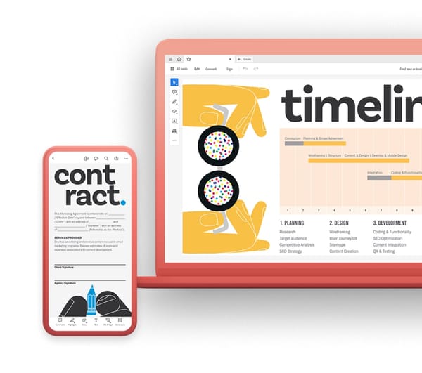
The magic of this pairing lies in their contrasting styles. Calvert's boldness cuts through the clutter, grabbing attention and establishing hierarchy, while Acumin's clean simplicity provides visual balance and ensures readability. This dynamic duo creates a visually interesting composition that resonates with viewers.
Unlocking the Potential
Here's how to harness the power of this pairing in your designs:
- Hierarchy in Action: Use Calvert for headlines, logos, and key information, letting its boldness command attention. Employ Acumin for body text and supporting elements, ensuring clarity and ease of reading.
- Weight Matters: Experiment with contrasting weights. Pair bold Calvert with lighter Acumin weights for a balanced hierarchy. Conversely, use bold Acumin for emphasis against regular or light Calvert.
- Embrace Color: Introduce subtle color variations to further differentiate the fonts and add depth to your design.
- Keep it Simple: Avoid using too many additional fonts, as this can disrupt the harmony between Calvert and Acumin.
Inspiration from the Masters
Numerous brands and design projects leverage this powerful pairing. Look to companies like Uber, Spotify, and the New York Times for diverse examples of how Calvert and Acumin can be used effectively.
Beyond the Basics
While the classic pairing is always a winner, explore alternative approaches:
- Mix styles and weights: Use italic Calvert for emphasis alongside bold Acumin weights.
- Vary color intensities: Employ a bolder color for Calvert and a lighter shade for Acumin.
- Consider alternative pairings: For a similar dynamic, explore Gotham and Proxima Nova, or Trade Gothic and Open Sans.
Conclusion
Calvert and Acumin, when paired strategically, create a visually captivating and functionally sound design solution. Their contrasting styles bring vibrancy and hierarchy, while their shared modern aesthetic ensures a cohesive feel. So, don't be afraid to experiment and unlock the potential of this dynamic duo to elevate your next design project. Remember, boldness and balance can go hand in hand, and Calvert and Acumin are the perfect pair to prove it!


